hidol | Brand Design
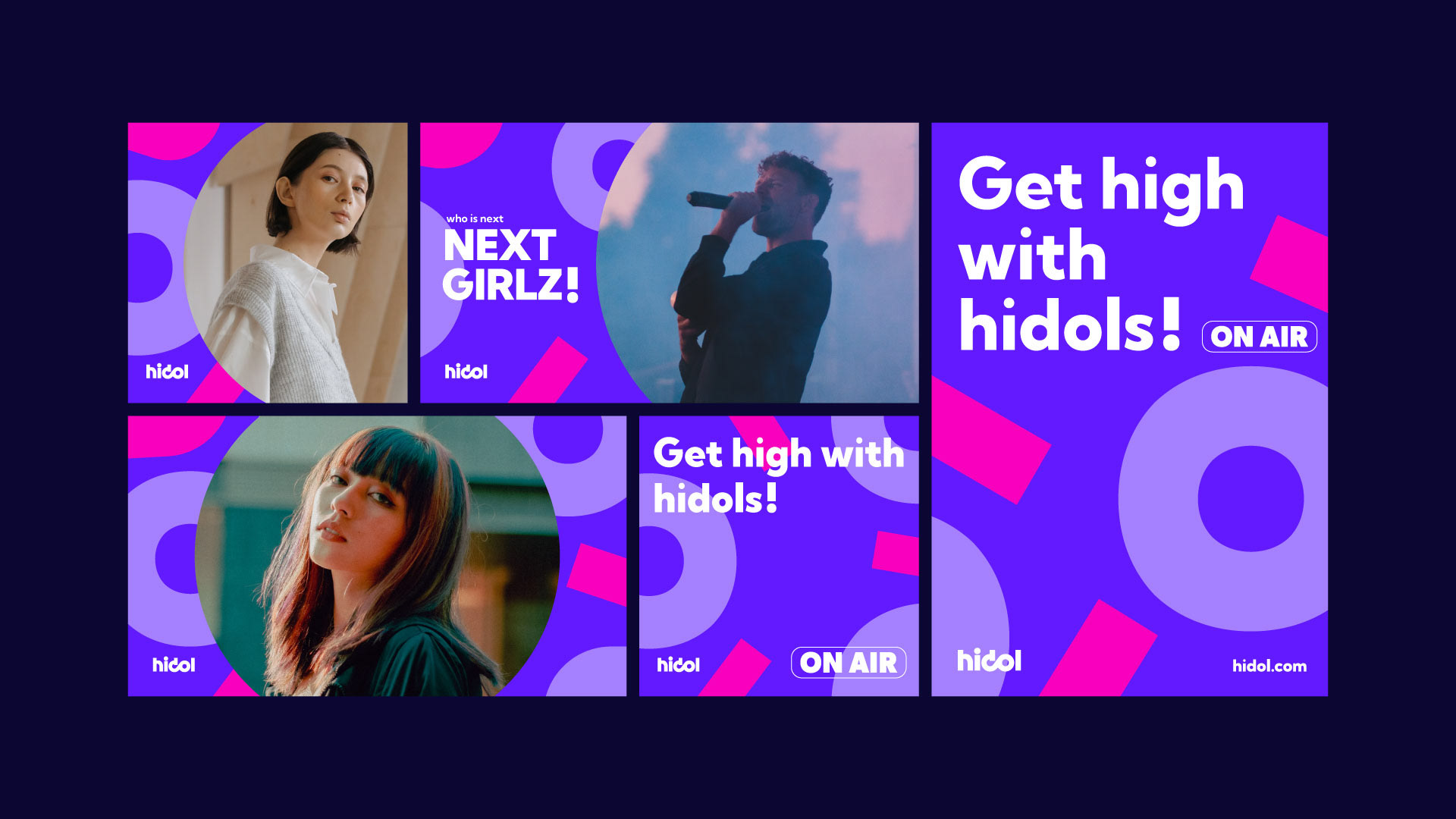
hidol 是從 beanfun! 轉化而來的全新品牌,針對原有平台功能複雜、使用體驗分散的問題,重新聚焦使用者需求,打造一個更純粹的創作者與粉絲互動場域。品牌以「情緒連結」為核心,串聯圖文、影像與偶像等多元內容,讓關係從單向互動,轉化為持續擴展的連結體系。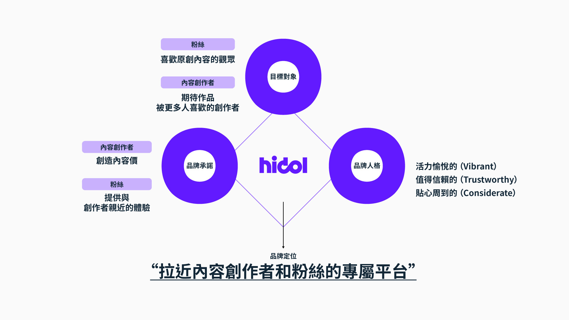
hidol | 品牌識別
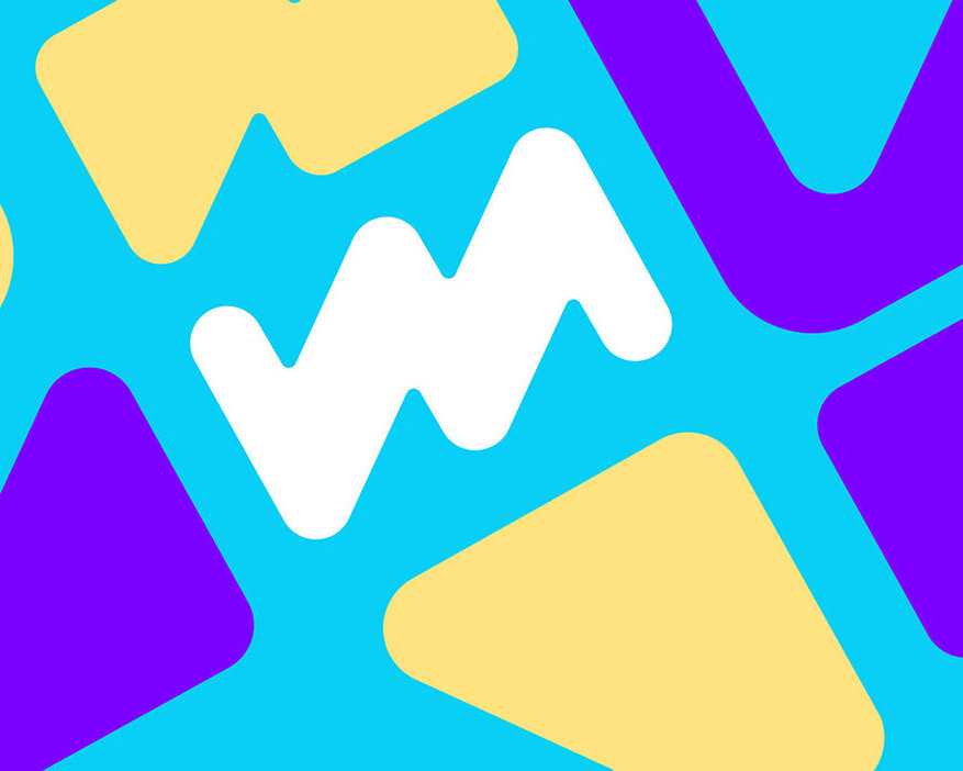
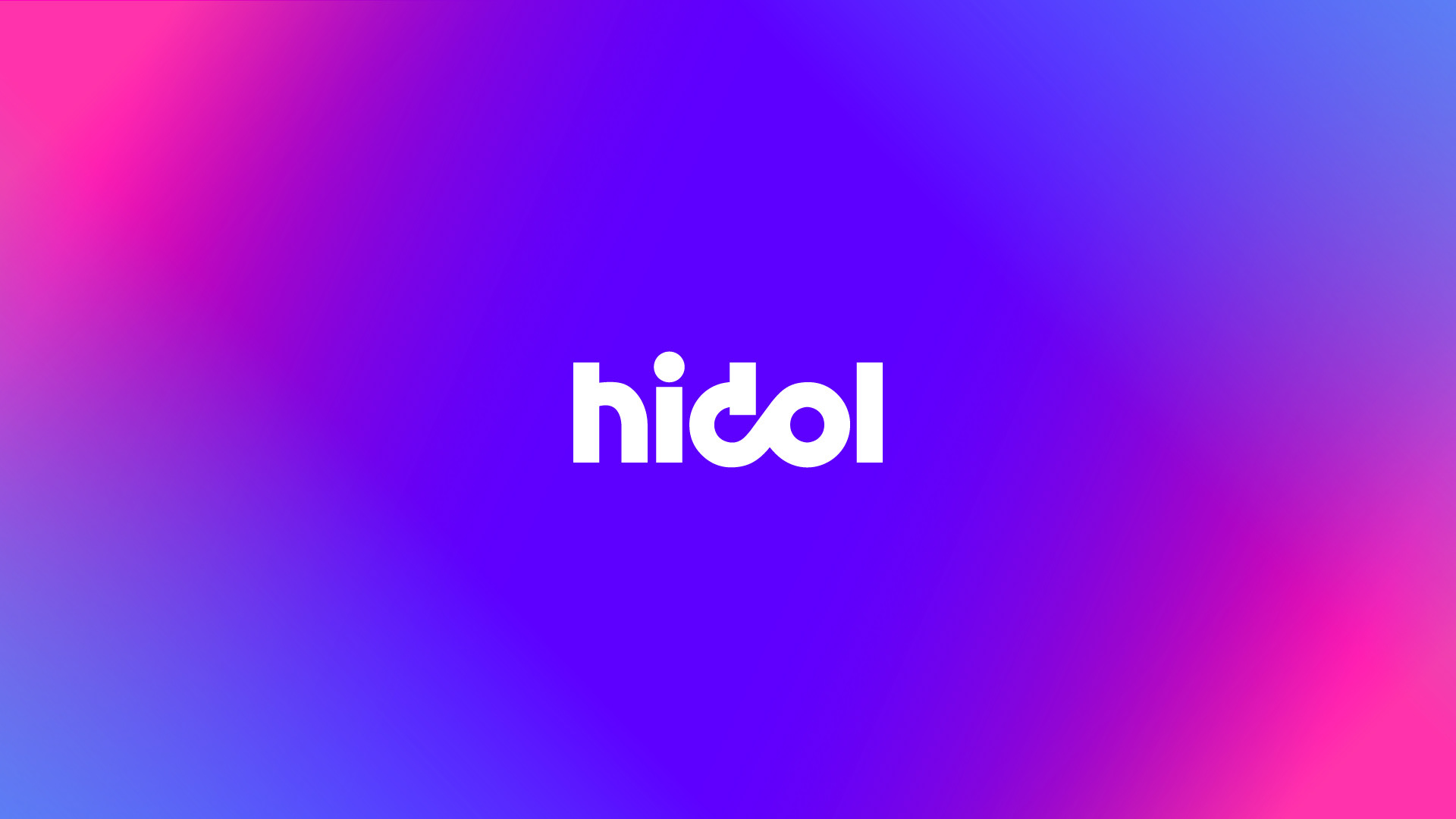
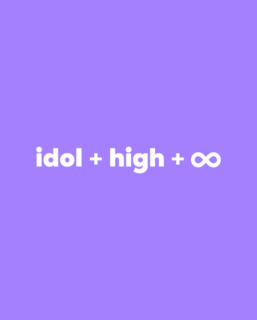
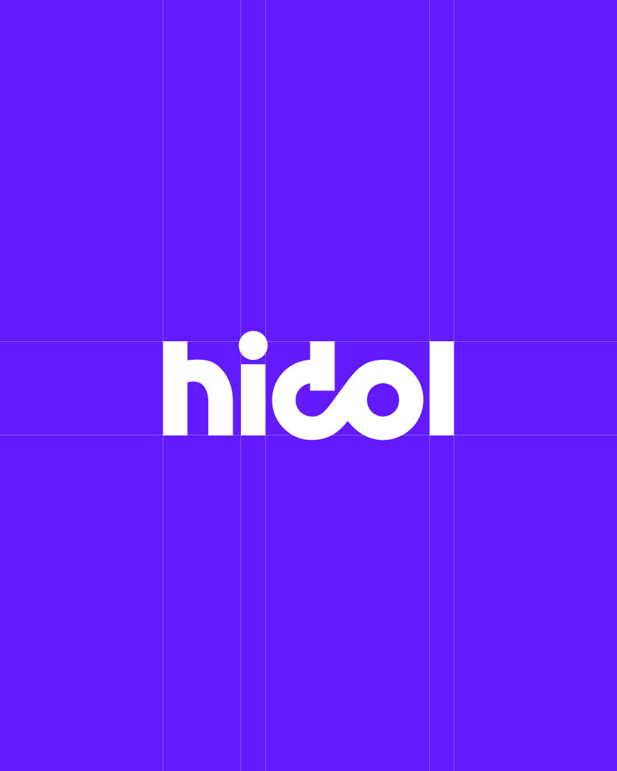
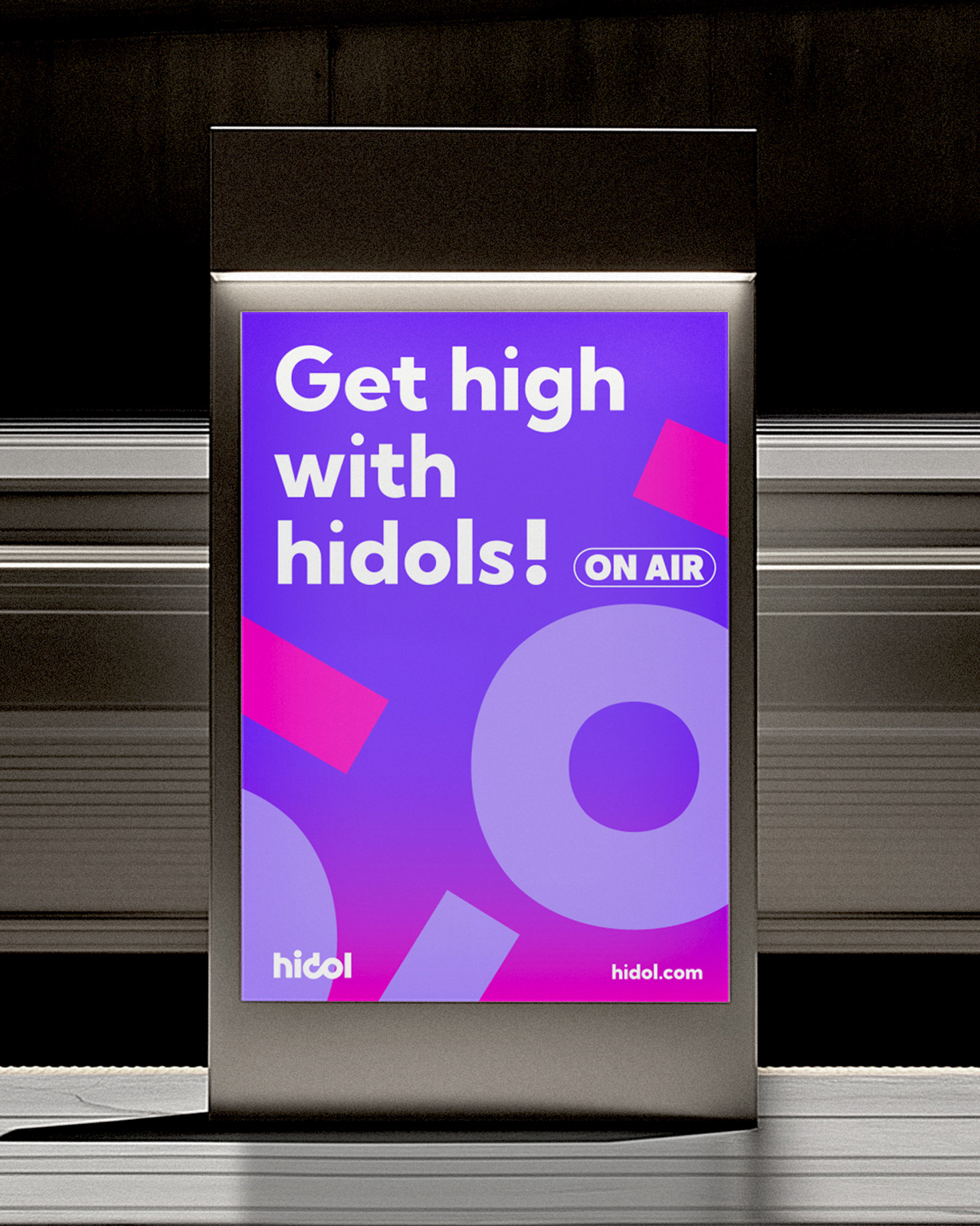
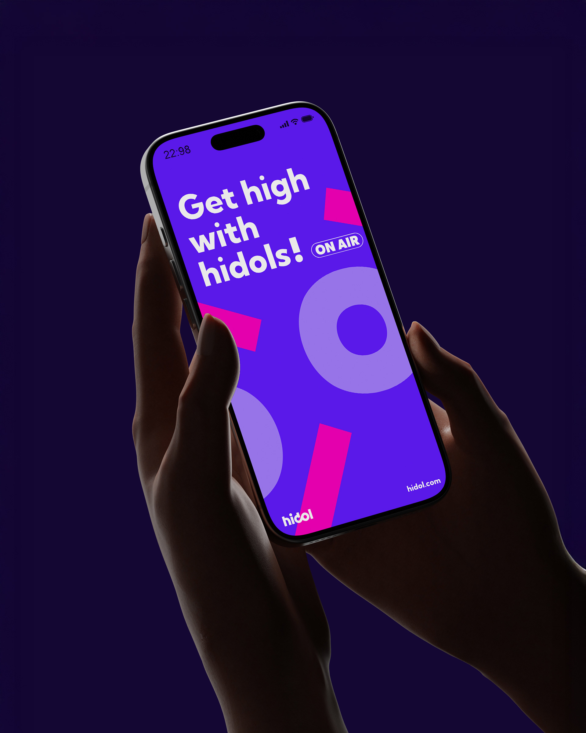
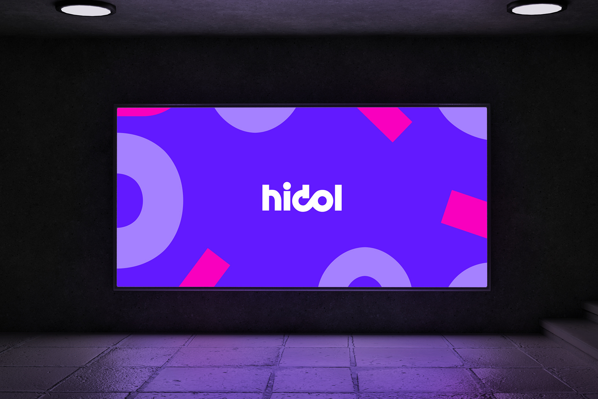
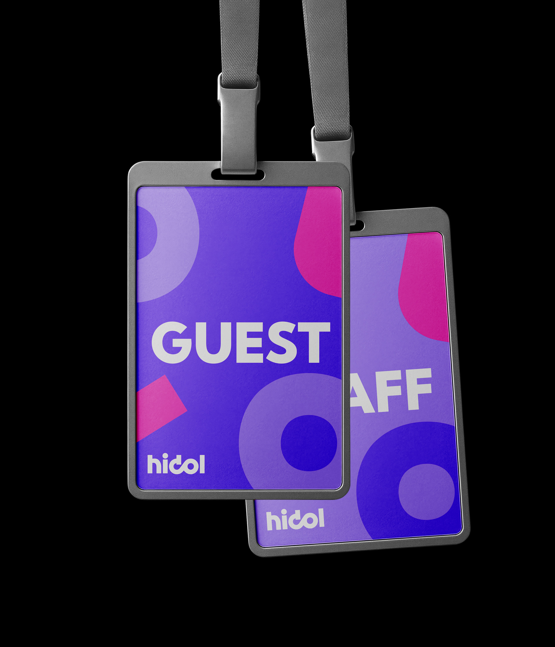
在視覺設計上,標誌融合「idol」與情緒狀態「high」,並結合無限符號(∞)的概念,透過偶像與粉絲之間的相互呼應、不斷循環,象徵從1無限,延伸至無限可能。色彩策略以高飽和紫為主軸,搭配淺紫與亮粉色,營造出兼具科技感與情緒張力的視覺語言,呈現一種持續流動、可被感知的社群能量。
Logo Design | Emotions Between Creators and Fans
The logo is based on “idol,” integrating the emotion of “high” and the infinity symbol (∞) to express the core relationship of the brand. Through typographic transformation, it forms a fluid and distinctive mark that represents the continuous and amplified emotional connection between creators and fans.
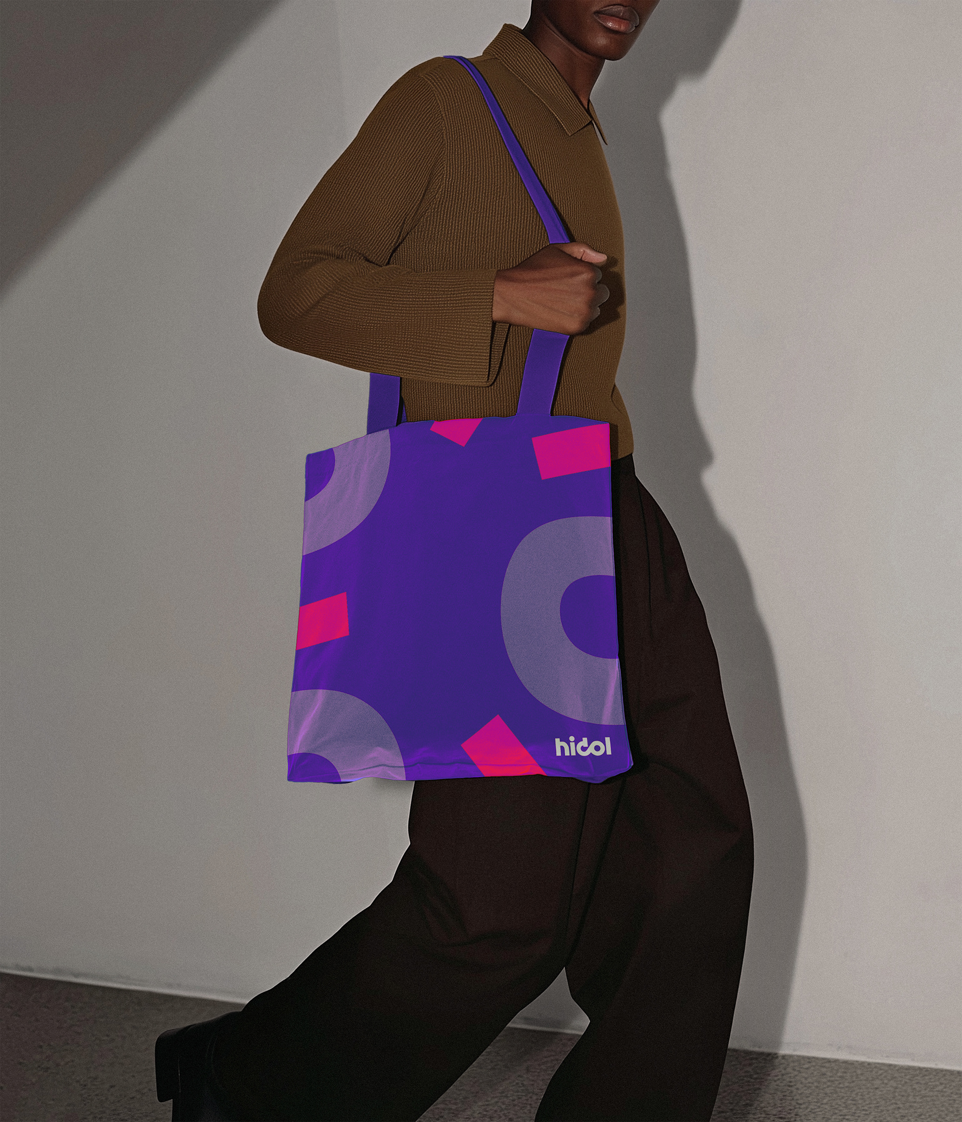
色彩系統 | 情緒與能量的流動
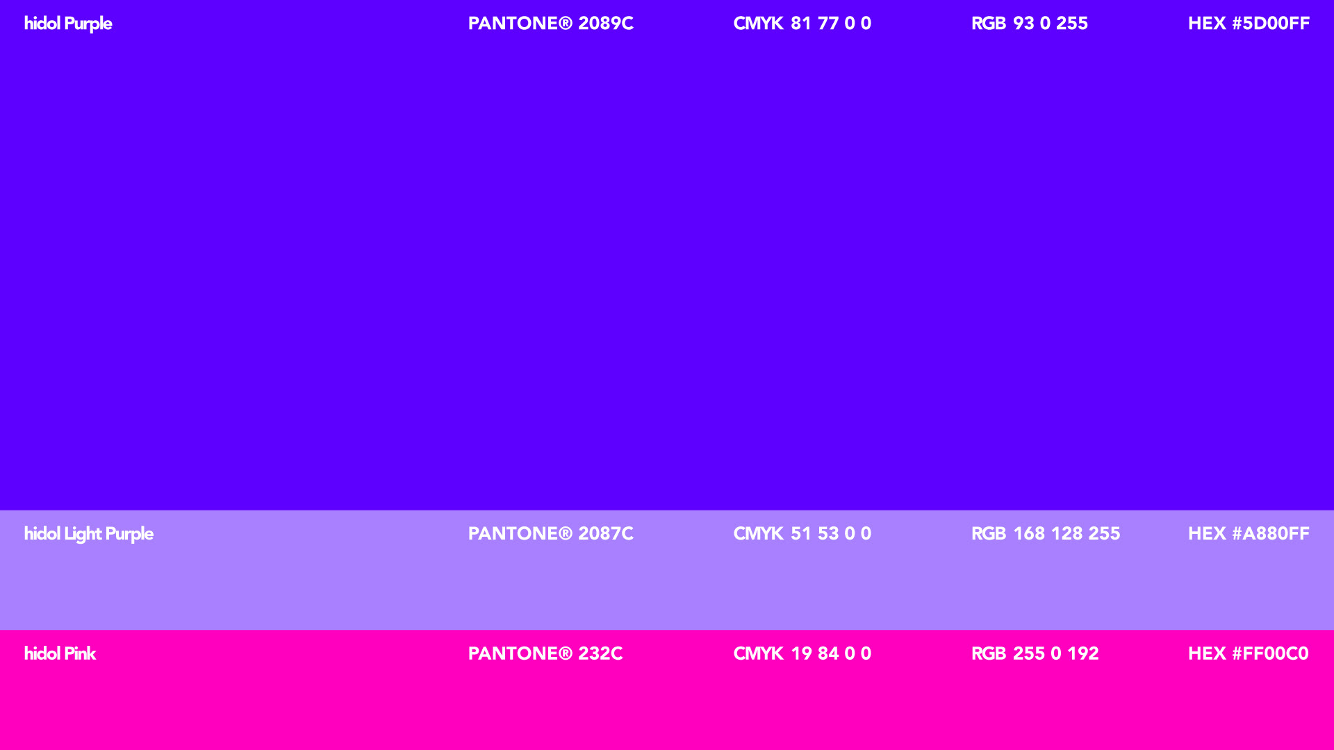
色彩以高飽和的紫色作為品牌主軸(hidol Purple),象徵創作能量與情緒張力,建立強烈且前衛的品牌識別。延伸出淺紫作為層次過渡,維持視覺的柔軟與空間感,並以亮粉色作為強調色,放大互動與情緒的瞬間。整體色彩系統在科技感與情感之間取得平衡,既具未來感,又能承載社群互動中的溫度與活力。
Client|遊戲橘子
Credit
品牌設計|dosomething studio
創意總監|王宗欣
專案經理|楊桂柔
品牌企劃|楊桂柔
識別設計|羊君
品牌設計|dosomething studio
創意總監|王宗欣
專案經理|楊桂柔
品牌企劃|楊桂柔
識別設計|羊君